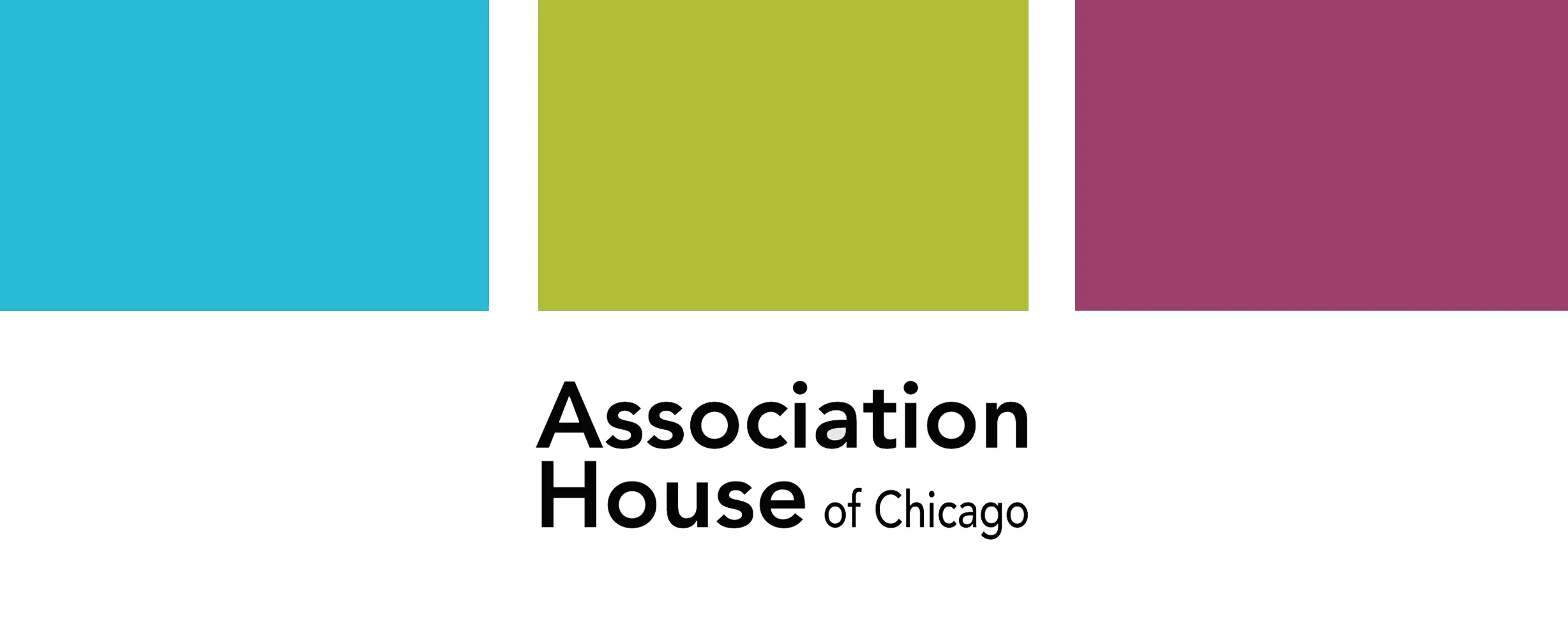
Association House of Chicago
Logo rebranding
Association House of Chicago is a non-profit organization offering human-services programs
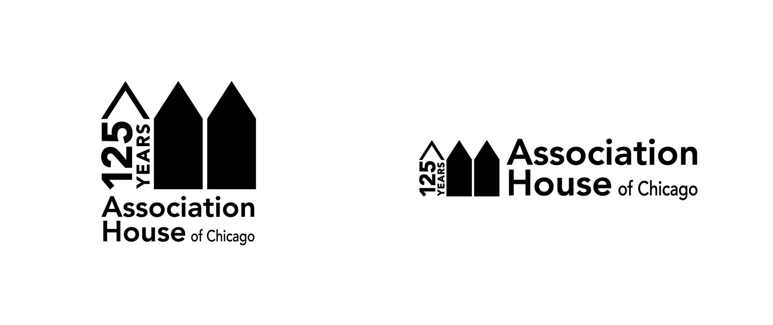
The Hot Idea team rebranded the logo for Association House. Here is how the logo looked before the rebranding
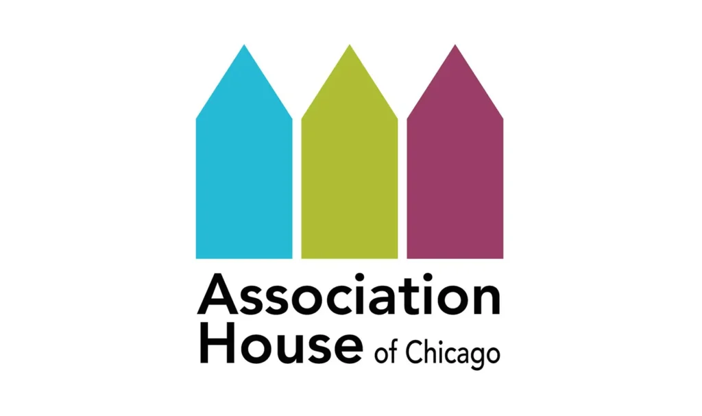
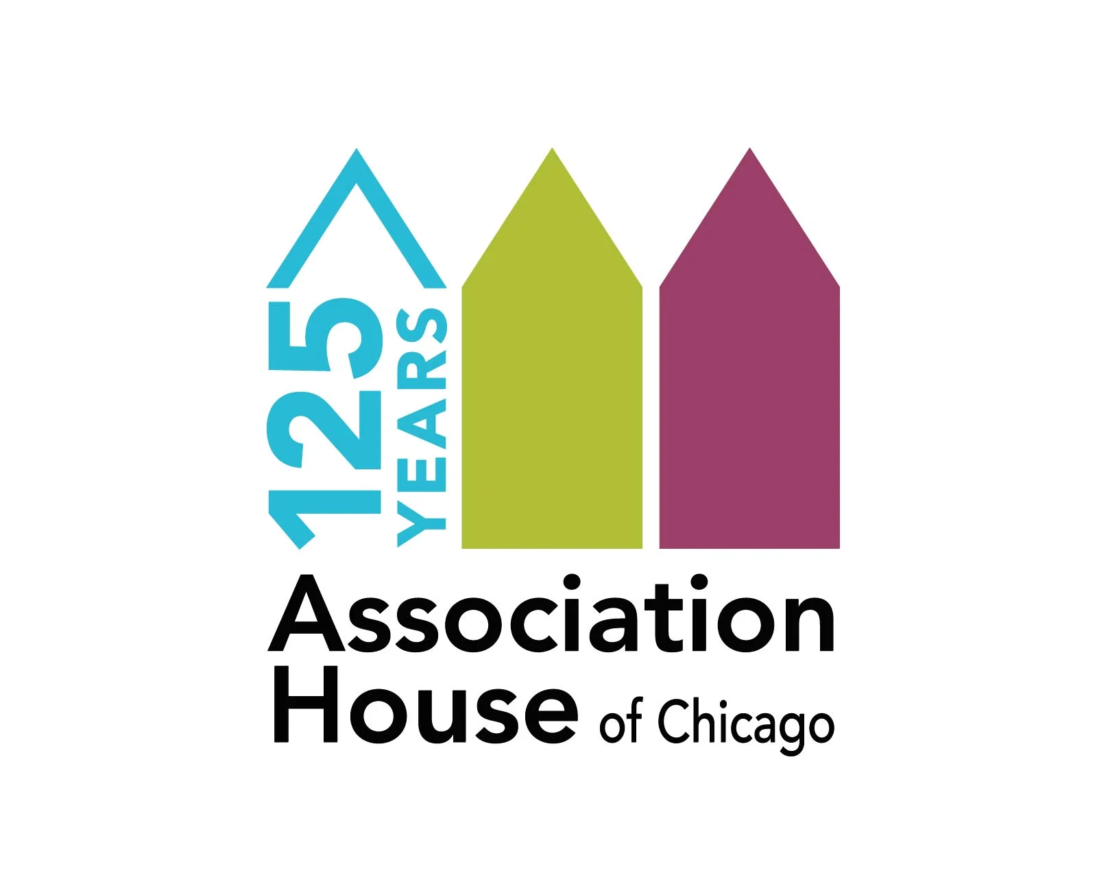
Association House needed a new logo for their 125th anniversary in 2024, and our task was to incorporate the number “125” while retaining the logo’s recognizability, colors, layout, and overall design.
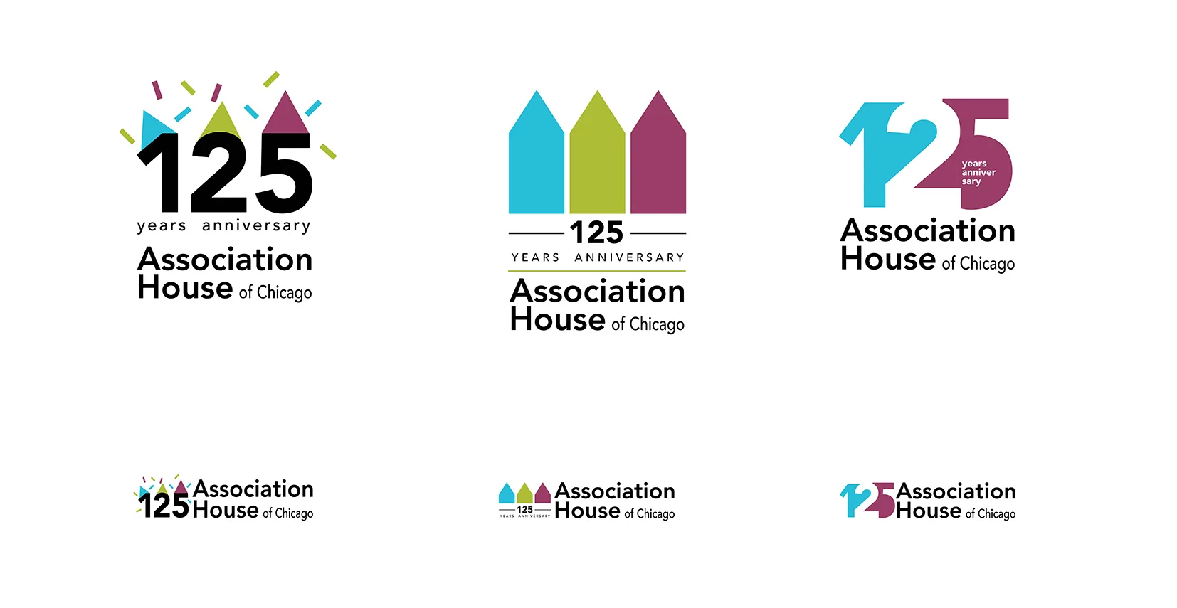
As a result of the development, several design options were proposed. The client faced a tough decision because they liked all the options
This was the final result. In this version, Hot Idea suggested replacing one of the elements with text. However, the image of the house does not disappear; it is perceived through the shape of the text.
Additionally, Hot Idea designed a horizontal logo and a black and white version of the logo