MCS British school | Client “CHUDO Volshebnyj zamok”
Logo design / Corporate Identity
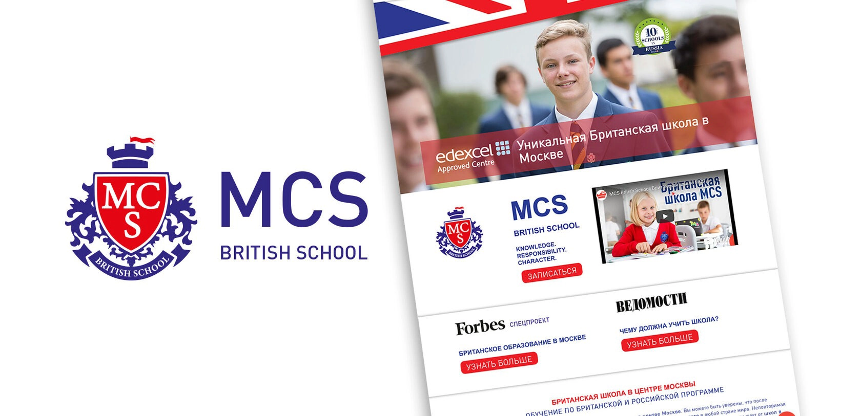
The main unifying element for the entire corporate style of the school was the logo, executed in a heraldic style and using the colors of the British flag.
The main unique offering of the school to its clients is British education in Moscow; therefore, the colors of the British flag and the flag itself were used on all the carriers.
Photos of the school and its students formed the basis of the image component of the booklet