Packaging for SUMITACHI Motor Oil | Client: SUMITACHI
Packaging Design
Packaging Design Development HOT IDEA successfully completed the packaging design for the “Sumitachi” brand – high-quality oil for boat motors. The client presented our agency with several key objectives, which were successfully achieved during the project.
The main goals of the new packaging development were:
— Expand the brand’s product range
— Attract new consumers
— Strengthen current market positions
— Increase sales volumes.
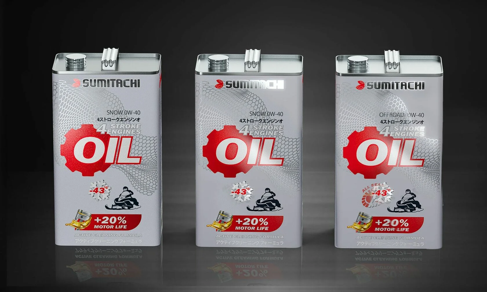
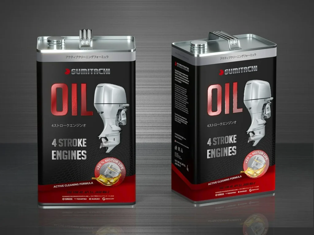
Aimed primarily at a male audience, the “Sumitachi” packaging needed to be concise, rugged, and clearly convey the product’s purpose.
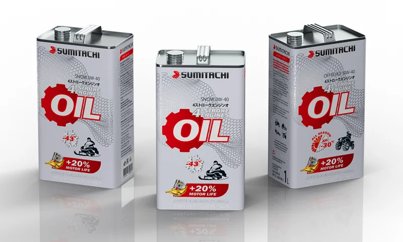
Additionally, there was a need to make an exceptional emphasis on the Japanese origin of the oil, highlighting this with Japanese symbols, a color scheme characteristic of the “Land of the Rising Sun,” and a clear design structure.
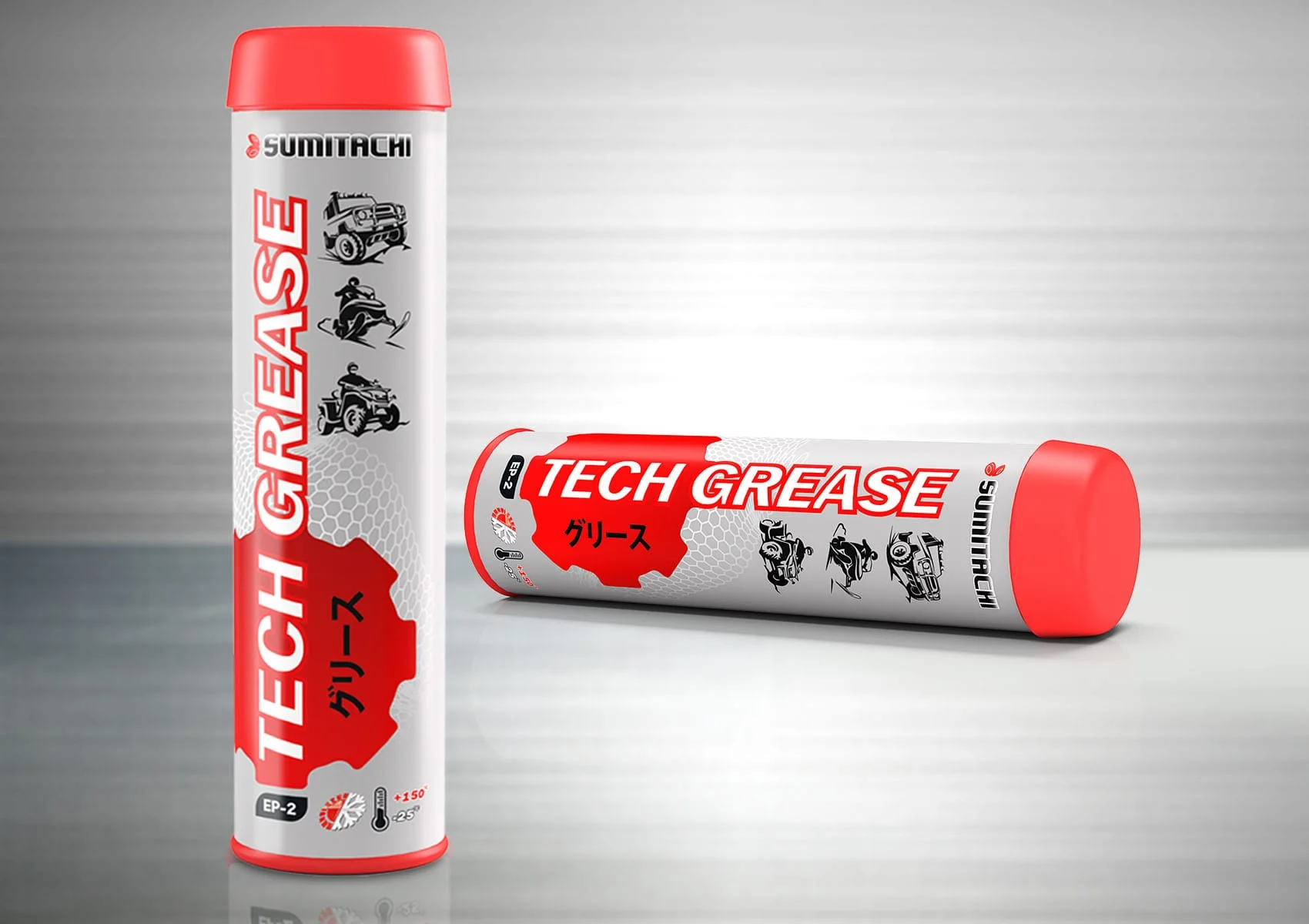
We can confidently say that the new “Sumitachi” packaging stands out among competitors with its stylish design. The metal can with bright accents distinctly references Japanese aesthetics, and the concise design and strict color scheme emphasize the seriousness and high quality of the product.
HOT IDEA successfully implemented the “Sumitachi” project, creating packaging that not only attracts attention with its beauty but also effectively addresses the goals of attracting the target audience and strengthening competitive positions in the market. The combination of style, functionality, and cultural identity makes the “Sumitachi” brand an outstanding representative in its niche.